Annual report design double page spread – World Bank
An annual report is an excellent opportunity to visually portray your brand’s story and articulate your strategic vision
Using the core principles of professional annual report design, you can create impactful publications that showcase your organisation’s achievements and vision for the future.
Our guide will walk you through the essential elements of creating engaging annual report designs that captivate your readers.
What is an annual report?
An annual report is a comprehensive publication that provides insights into an organisation’s financial position and operational activities from the previous year. It typically includes detailed financial statements, such as the balance sheet, income statement, and cash flow statement, along with notes and explanations.
Additionally, annual reports often feature:
- A message from the CEO or chairman
- An overview of the organisation’s strategy
- An analysis of market conditions
- Performance highlights
- Visuals highlighting recent accomplishments
- Information on corporate governance and social responsibility initiatives
- Forecasts about future performance
An annual report provides stakeholders and other relevant parties with information about the organisation, which they can analyse to make informed decisions and investments.
In most countries, annual reports are mandatory for certain companies.
Why design really matters for your annual report
Many view annual reports as compliance documents with financials, statistics, and other dry details. But in truth, an annual report is an excellent opportunity to visually portray your brand’s story, create brand awareness, highlight your achievements, share information, and articulate your strategic vision.
Here’s why the design aspect of your annual report design is so important:
- First, looks matter. A visually appealing report grabs your readers’ attention — people are more likely to read a well-designed annual report than one that looks dull, cluttered and uninspiring.
- In our data-overloaded world, we have a small window to engage readers and an even shorter window to keep them from being distracted.
- Second, your annual report is an opportunity to reinforce brand identity and set your organisation apart from competitors. An annual report is a public document that should visually demonstrate your brand’s values, personality, and mission. Potential investors will view your annual report with interest, so there is a marketing component to annual report designs as well.
- Third, design helps you communicate information effectively. Persuasive visuals engage your readers, making them feel more involved in the narrative.
- Lastly, the design of a great annual report makes complex information more accessible by breaking it down into clear, digestible visual sections and infographics.
In short, the design of your annual report isn’t just about aesthetics. It’s a crucial tool for effective communication.
Understand your audience
Great design meets the needs of its viewers. Before designing your annual report, think about your audience. Who will read it? Shareholders, clients, customers, or employees? Each group has different expectations and preferences. Tailoring your design to meet these needs is essential.
For example, an annual report with interactive features might be great for a young, tech-savvy audience. However, a more traditional design might be better if your audience prefers printed materials. Consider age, skills, interests, and reading habits to choose the best design elements.
A design that matches your audience’s preferences makes the information you’re presenting achieve a more significant impact.
Storytelling through design
Effective annual reports don’t tell; they show — visual storytelling is about engaging imagery. An impactful visual narrative combines the big-picture story of your report with detailed insights, guiding readers through your organisation’s journey over the year.
Take a look at The Ethical Agency’s 2022 Annual Report for The National Business Initiative (NBI). We used visuals to blend brand narrative seamlessly — each section builds upon the last, creating a unified story across visuals and text.
Remember: every design choice, from layout to visuals, influences how readers interact with your report. Focus on thoughtful design that seamlessly leads readers through each section.
- A good story has a clear beginning, middle, and end with chapters that weave a logical narrative—e.g., character, setting, conflict, plot, and theme. Map your story(s) with such structure.
- A classical story contains a problem and a solution, i.e. complications, a crisis, a climax and a resolution.
- Good storytelling involves people, communities and emotion.
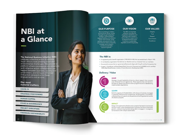 Annual Report Design — National Business Initiative
Use a visual design hierarchy
Visual hierarchy is about arranging design elements to guide attention effectively. It helps contrast vital information in your annual report, even if readers are skimming content.
Colour also plays a significant role; bold colours highlight key areas, while softer colours provide focus to text or graphs. Typography matters, too. Different fonts and text sizes change how information feels and flows. Large fonts work well for headings and big idea statements, while smaller fonts suit supporting details and body copy.
Mixing font styles adds variety and space. Good spacing guides readers effortlessly through your report, separating sections for a spacious, calm, and comfortable reading experience.
These are all elements of visual hierarchy. When undertaken well, visual hierarchy ensures your core points are communicated effectively.
Focus on readability
A great annual report design doesn’t just look good — it also reads well. Readability is about making it simple for your readers to understand your text.
Here are a few pointers:
- Start with clear, easy-to-read fonts. Stick to 9-12 point sizes for main body copy text. Headings should be significantly larger and distinctive.
- Leave enough space. Use wide margins, generous paragraph spacing, and clear headings. This will provide readers with visual content breaks and make information easier to digest. Don’t cram too much content into too few pages. Consider your page layouts — don’t be afraid to dedicate entire pages to an image/photograph.
- Clean design. A clean design and layout help readers focus on the content. Don’t fill every inch of space — space balances your layout and reduces distractions.
- Use imagery and photography to balance out the text – a picture paints a thousand words — the more imagery used, the less the content will feel like walls of text.
- Balance text with infographics and diagrams. Diagrams, charts, and infographics make complex information simpler and more engaging.
Always find the right balance between aesthetics and readability — readers will thank you!
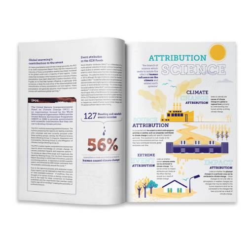
 Annual report design — Presidential Climate Commission
Incorporate infographics and visualisations
One of the most impactful ways to present data effectively in an annual report is through infographics and visualisation. Malcolm Gladwell once said: “The key to good decision-making is not knowledge. It is understanding.”
Infographics and data visualisations provide just that, transforming dense information into clear, easy-to-understand visuals that improve comprehension and recall.
Here are some valuable tips:
- Simplicity is key: Keep your design simple and focused. An overloaded infographic or visualisation can distract your readers, defeating its purpose. Use minimalistic designs that convey only one idea at a time.
- Use appropriate charts: Different types of data call for different charts. For example, a bar graph might be more effective for comparing data, while a pie chart can represent proportions. Choose the chart type that accurately describes the data you are communicating.
- Aim for a story: Using infographics and visualisations reinforces your overarching story. Ensure visual aids adhere to your overall report design theme.
- Consider size and scale: Ensure graphics are proportional to their message. Misleading scales can distort data representation and lead to inaccuracies.
- Use pull quotes and statistics: Use pull quotes and key statistics from your content, and articulate them with infographics and large typography to drive key messaging.
- Annotations help: Use text sparingly to add context or draw attention to critical information.
 Publication design — Centre for Environmental Rights
Think digital in your annual report
In the digital age, interactive elements may be needed to captivate busy readers, making your annual report engaging and dynamic while elevating reader investment.
Interactivity comes in many forms, from embedded videos and interactive charts to clickable links leading to related content or different sections in your annual report or website.
For interactive features to work, your annual report needs to be exported as a PDF.
One interesting annual report design tactic is to create a shorter annual report where the reader can be directed to specific pages on your website if they are interested in the most up-to-date information.
Here are some straightforward steps:
- Identify opportunities: Determine which part of your annual report can benefit from an interactive feature. It could be a complex infographic simplified with hover effects, a case study shown through a video, or a long section navigated through anchor links.
- Create quality content: Simply adding interactive elements will only work if your content is compelling. Ensure videos, graphs, and additional linked content provide value, enhance comprehension, and align to reinforce the overall objective of your report.
- Test: Before publishing, do a dry run to ensure interactive features work seamlessly across multiple devices. You wouldn’t want to annoy or lose your audience because of non-functioning features.
Adding interactivity as a design element in your annual report can enrich the reader experience by bridging the gap between traditional reporting and immersive experiences, as well as keeping up with modern times
Design captivating report covers
First impressions matter. And it all begins with your cover design.
Effective cover designs combine compelling visual elements, creative conceptual design, and a distinct aesthetic quality that complements your brand voice—like a handshake or a first hello.
Covers should prime your readers’ minds and set the tone for what lies within.
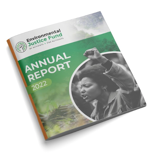 Annual report cover example – The Environmental Justice Fund
Wrapping up
Our guide has shed some light on the significance of considered design in crafting impactful annual reports.
Here are the main points:
- Understanding your audience is key and should guide design decisions.
- Visual storytelling maintains engagement throughout the report, with every element contributing to your brand’s narrative.
- Visual hierarchy further enhances effectiveness by guiding readers to crucial messages.
- Readability relies on balancing text and visual aids.
- Infographics and visualisations simplify complex information.
- Interactive elements like videos and animations add engagement, transforming static reports into dynamic experiences.
- Don’t underestimate the power of a striking cover.
Whether you go the DIY route of working with your in-house design team or hire a professional annual report design partner, ensure your annual report has personality and “life”, reflects your brand identity and resonates with your audience.
Contact The Ethical Agency for your annual report design needs.