Psychedelic facade: Jody Paulsens 'Everything is just Wonderful' suggests that beneath their luminosity lurks decay, aging and suffering.
Artist and designer Jody Paulsen’s latest show, Water Me, at Smac Gallery, Johannesburg, with its usual but singular iridescence, has more to offer the viewer than mere facile gaudiness. After a brief repartee with the gallery manager, who praised the artist’s recurrent penchant for conjuring joy, I was left pondering the psychic role colour plays in art. A discourse on colour, perhaps in its lustrousness, merits a little urgency, and Paulsen’s work invites such a meditation.
I had first seen Paulsen’s work in the 2015 group exhibit Young, Gifted and Black, curated by Hank Willis Thomas at the Goodman Gallery, Johannesburg. He’s gone on to be a part of many local and international shows and his works are in numerous prestigious art collections.
Water Me explores issues of nurturing and beauty, as exemplified in botanical life, and the genre of still-life painting. Guided by the clichéd equivalence often drawn between flowers and women, the show also declares a consideration of the prospective lives of “career women, women on fire, women who flourish and women who are not afraid to be vulnerable”. The injunction to “water” is a demand for care, and the continuity of youthful beauty. Moreover, as the show’s brochure notes, it is about the anxiety that comes with growing.
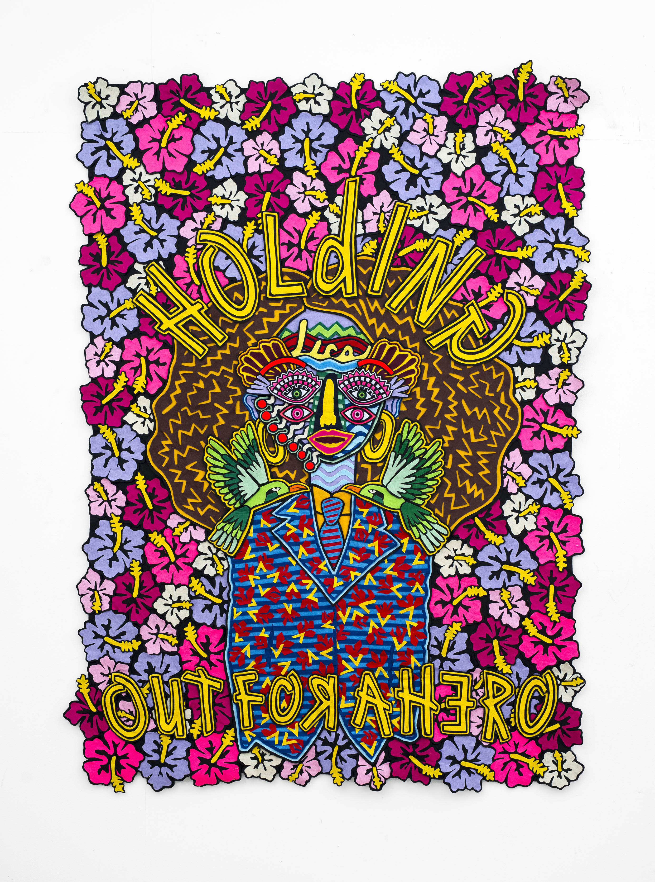
Holding Out for a Hero. 2018. Jody Paulsen
Felt is his preferred medium for constructing these lustrous collage objects that are sliced before being stacked into a thousand shapes, colours and letters of neopop tapestries. Here, felt teeters on the brink of losing its sense of simplicity and innocence. It is displaced and re-placed. These quasi-tapestry-collage “things” still need to be given a description that fits, but they heed the graphic influence that pervades them. His use of typical design tricks such as visible outlines, fonts, shapes, mostly saturated flat colours, and so on, particularly illustrates this. In fact, when one looks at the precision of his seamstress-like cutting, it is no surprise at all that Paulsen has a foot in the fashion industry as well.
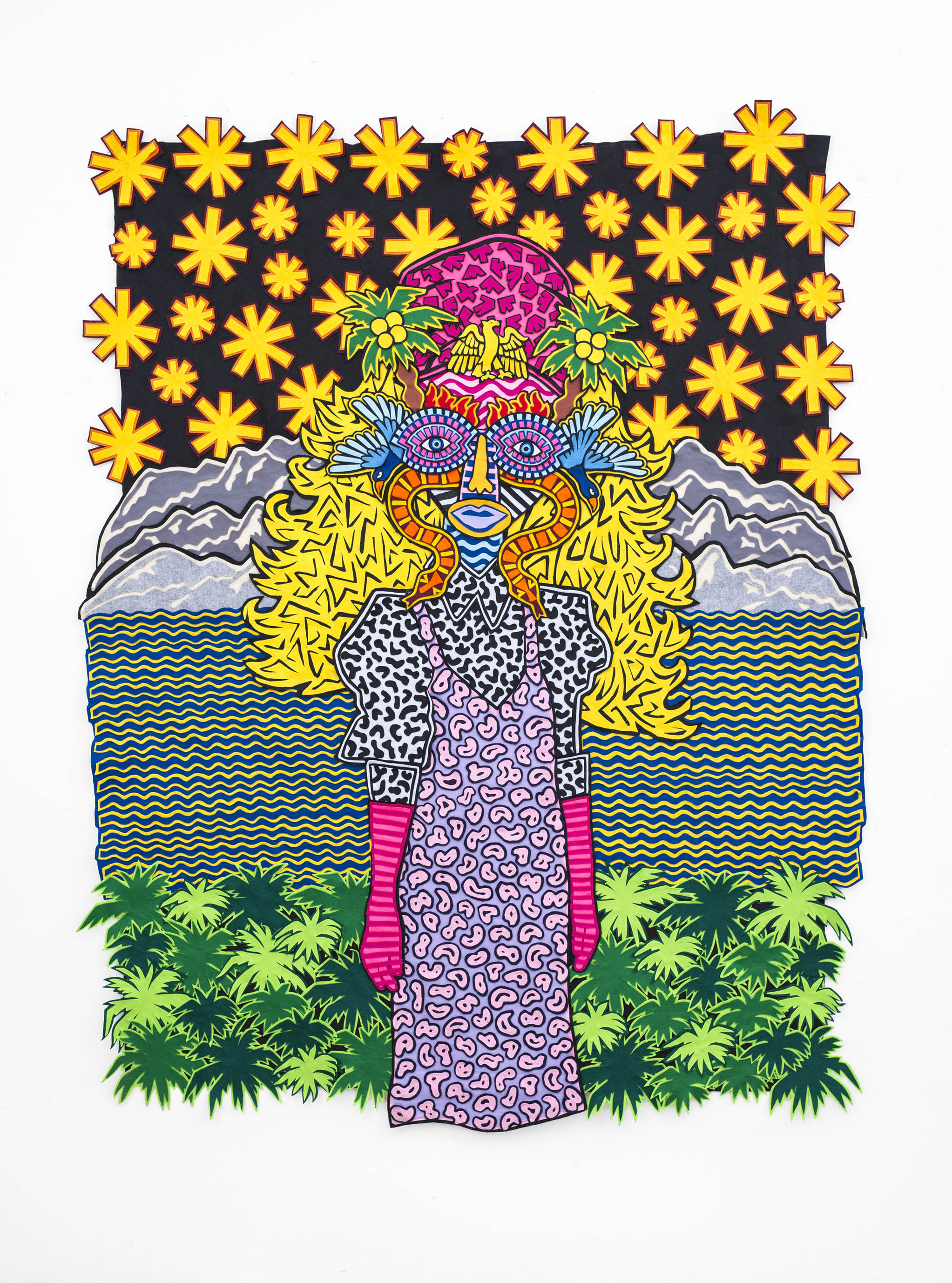
Starry Night invites the viewer to marvel at Paulsen’s obsession with detail, but also to realise the dissuasive power of his artworks.
Colour and shape play markedly psychedelic roles in the work as each piece that’s sliced and mounted is considerately placed. This generous use of colour can only be rivalled by artists such as Athi-Patra Ruga, Thania Petersen, Lawrence Lemaoana, Khaya Witbooi and Simphiwe Ndzube, whose economy of colour appears at times in excess but visually enchanting. These artists, in their commentary on critical issues, skillfully make use of alluring and charming forms of mainstream culture. For instance, the luminous ice-cream palette in Paulsen’s recent work can seem whimsical and fantastical, but the propensity for “play” is structurally necessary for its classification as contemporary art. It is form-stretched and disorganised, at times appearing idiosyncratic, but equally generative. Thus we walk into Paulsen’s forms with ease, marvelling with every step at the chromatic symmetry of his compositions, the decorative flair of his touch and the general flamboyant aura.
It is when we stare at and study the intricacies, indeed excesses, of his proclivity towards accuracy and the fanatical obsession with detail that we realise the dissuasive power of these objects, not only at the level of subject matter but also in colour itself.
Sophomore. 2018. Jody Paulsen.
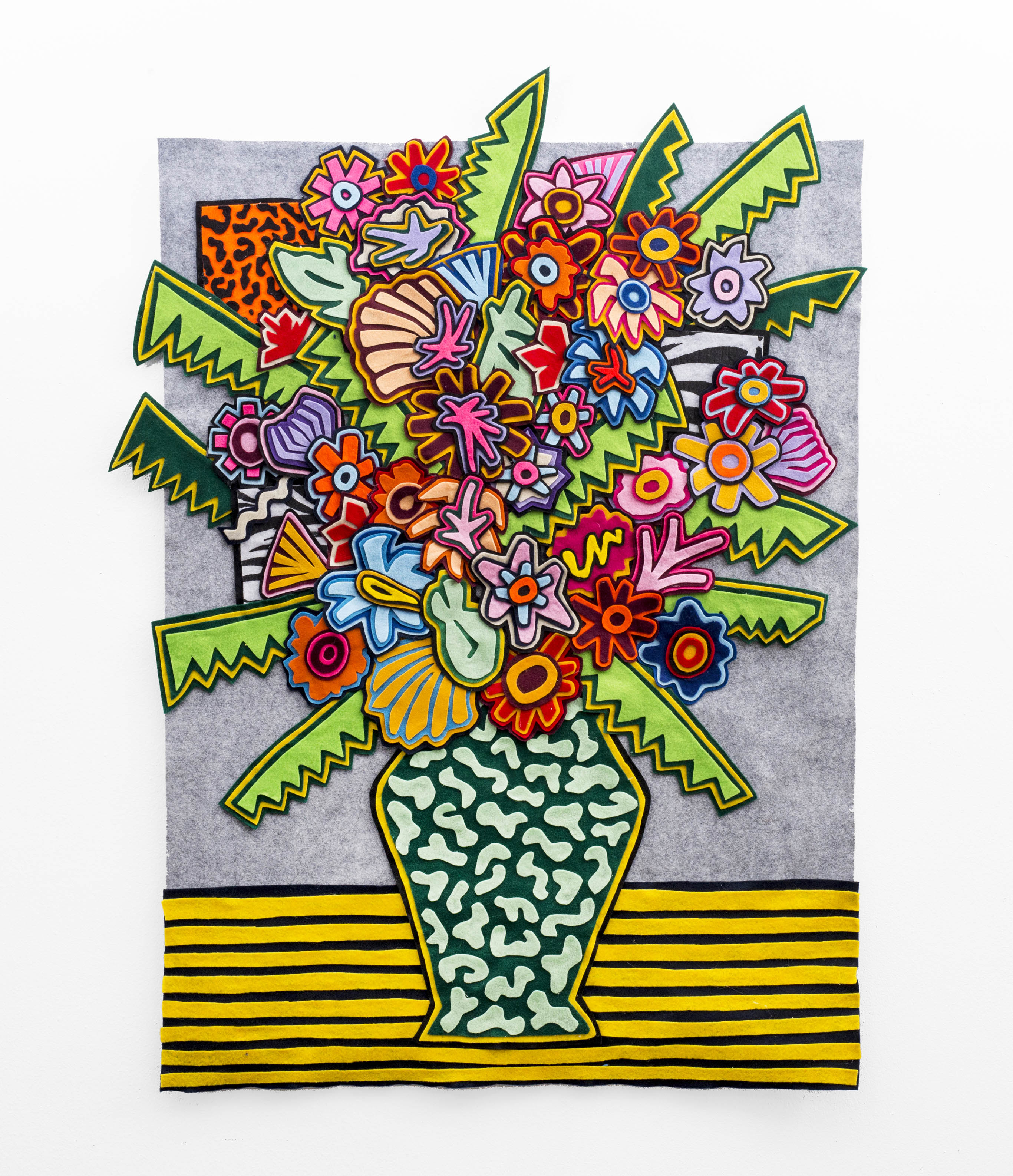
Water Me foregrounds the benign desires for beauty and slaying, adopting still-life painting, particularly of bouquets, as visual metonymy.
Though noted for their unobtrusive figuration as inanimate objects, Marxist art historians such as TJ Clark, whose reading of Paul Cezanne’s still lives finds them to have a haunting “recalcitrance”, which refutes this commonplace assumption.
The same can be said for portraits, landscapes or even religious art where our eyes don’t see beyond the enchanting plains or golden trinkets with shiny apples, as it were. That is why, for the longest time, we’ve read genre paintings as apolitical visual tableaus. I think Paulsen’s images stage a similar treacherous ruse in the obvious ways in which he offers us familiar visual cues that initially inhibit us from doing the heavy lifting.
What is it about lustrousness that conjures ease and happiness? What about its seductive (or sedative) chromatic flamboyance that indexes repulsion of darkly forces? Common expressions such as “to add a bit of colour” instantiate this aversion in ways that reflect, daily, a certain denialist impulse in our society. The concept of the rainbow nation, now criticised for not creating a nation “at peace with itself” is a palpable testament to this proclivity towards denialism. It is this proclivity towards iridescence, a contradictory admittance to “colour-blindness” by way of overissuing colour, that is symptomatic of the superficial exfoliation of the Du Boisan colour-line.
This sense of visual acquiescence, the insatiable need for enjoyment or opulence at any cost, is something demanded of us by the status quo. The injunction to enjoy more is an ideological prerequisite that takes all kinds of forms, whereby its opposites — race and lack, for example — are written off as antiquated things.
It is the disturbing (in a good way) nervousness in the pristine and meticulous handling of the medium that makes one rethink Paulsen’s work. That is, to think through and beyond its aesthetic utopias, and wander off into the dystopia it raises by omission. The gathering, cutting, arranging, planning and so forth — all labour- intensive — crystallise in the final product, like cheerful toasts at an after-work drinks. The flowery look of the works appears to elide this labour, much as the celebratory aura effaces the monstrosities. Images such as Colorful, Dear Ben and Girl on Fire display benign titles that show no particularly ostentatious theme.
Beneath this foregrounded luminosity, however, lurks decay, aging or suffering in the innards of beauty.
In the era of the largely social media celebratory movement of #BlackGirlMagic, Girl on Fire is an apt descriptor of the current pulse. Being on fire could translate to resilience and steadfastness, but one has to be quite circumspect without being dismissive about how these infernal cycles of public valorisations play into the hands of power. The portrayal of a bouquet titled More More More, in which abundance itself isn’t only a social decree but a testament to visual surplus in the work, is reminiscent of the technologies of neoliberal containment. Is the desire for more always already implying a craving for capitalism? Though Paulsen’s work has tendency for excess, a great part of it can also be quite shallow.
Water Me asks us to think about the negative implications of the discourse of the “now” and the inclination to control time that comes along with it. Time and beauty, much like life and death, are central themes subtly working in the shadowy corners of this show. But time, like beauty, is chained to the existential realities of the elite leisures, captured by privatisation. On the other side, colour is not used as a neutral or light medium that only fills in the gaps, but as an ideological mode of narrativising, manipulation as well as obfuscation.
We are thus torn between this visual excess of skillfully collated felt objects, and the conceptual anxiety towards decay, the ugly — the unwatered — in ways that urge us to see beyond what the artist offers. This calls to mind the words of the late veteran artist Peter Clarke’s linocut print Weeds Can Also Be Beautiful. Paulsen is a gifted artist and his work is destined to astound us even more.
Water Me runs at the Smac Gallery until February 9