Osmond Tshuma’s ‘Colonial Bastard’ typeface shakes the canon of typography in Africa
Good type is rarely linked to the African continent. The first time someone asked me which font I liked the most some years ago, I thought to myself surely it must be Helvetica. I saw it everywhere. It was beautiful, modern and universal, I suppose. It could fit almost anywhere. The design tutorials I watched online (almost all of them American) held Helvetica in such high regard that it surely had to be the best.
But when I began compiling my graduate project and learning more about design in Africa, I learnt that not only did we have our own design histories, but also that so many of our nations had unique writing systems that held within them history, tradition and culture. I learnt of Saki Mafundikwa, a Zimbabwean graphic designer whose goal is to foster what he calls an “Afrikan Renaissance”, encouraging creatives to look within and not beyond the continent for inspiration.
I cannot only blame the online tutorials I watched for making me believe that Helvetica was superior; I am surrounded in Zimbabwe by design – typography to be specific – that was mostly created by Europeans and Americans. My phone even has Helvetica as its default font.
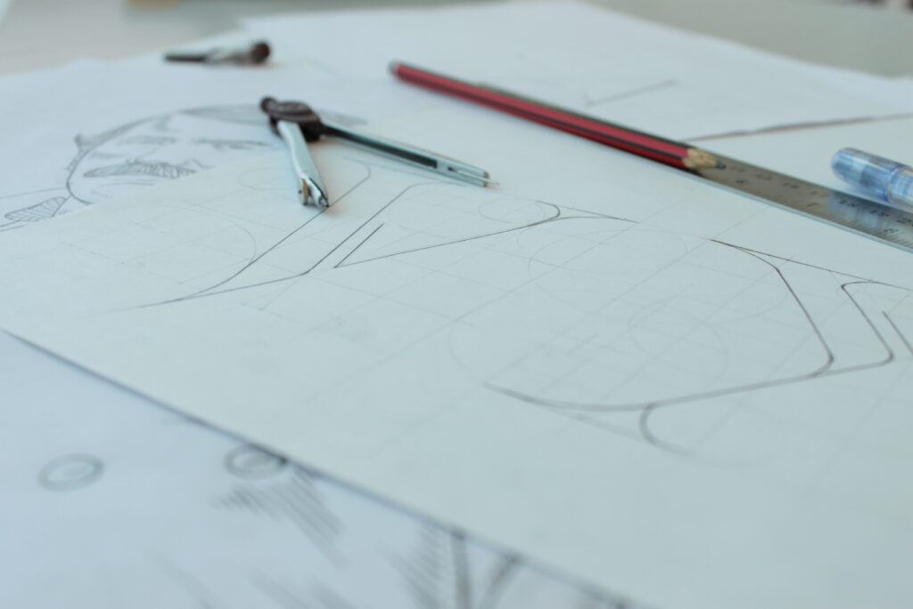
As I continued researching, I came across Colonial Bastard, a typeface created by Zimbabwean born Osmond Tshuma. It was born out of Tshuma’s graduate research in 2013 on postcolonial advertisements in Southern Africa.
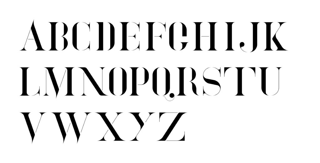
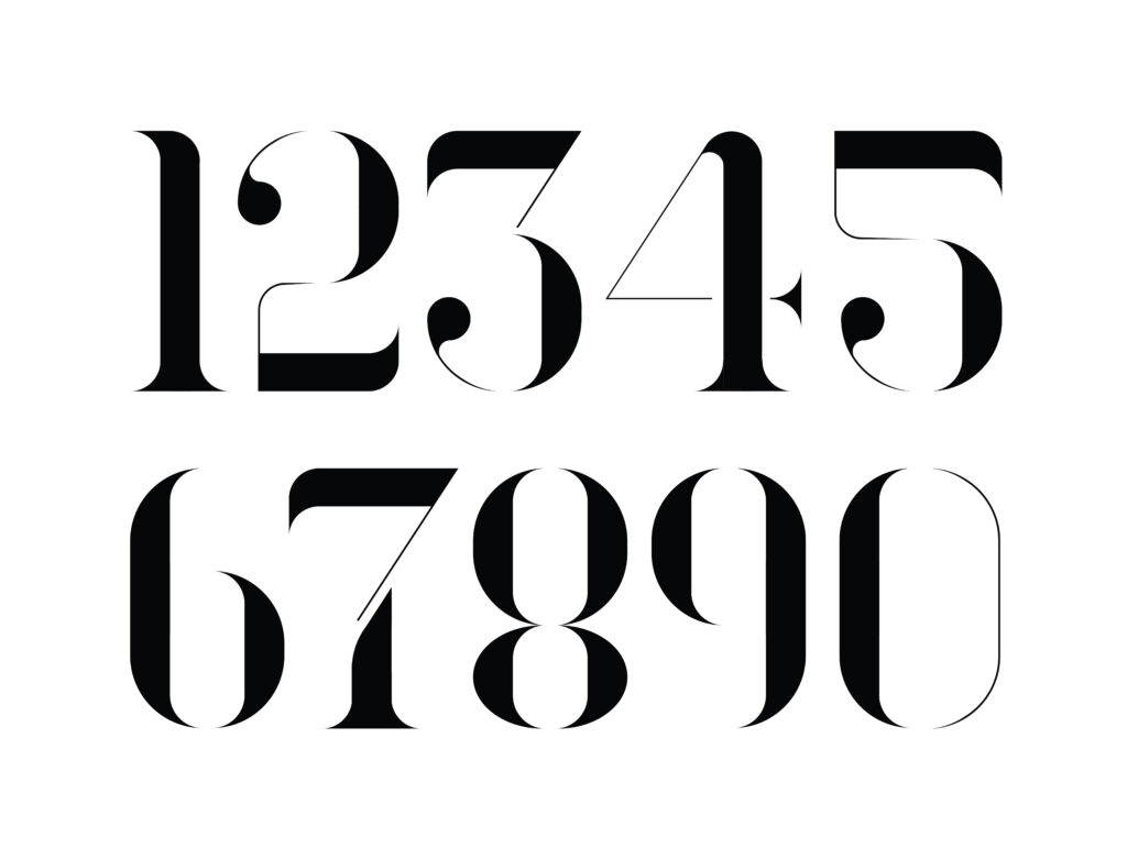
Tshuma uses typography as a means of speaking back to history. He says the typeface is meant to echo “characteristics of Cecil John Rhodes – a wealthy, power-hungry imperialist.” It is a social commentary on power and control as illustrated by colonialism through advertising material.
Tshuma’s point of reference for the typeface was the Pears’ Soap “The White Man’s Burden” advertisement from 1899, which invoked racist stereotypes depicting the African as “unclean”. The point of power and control in the typeface is in how it captures and adapts the typography used in fulfilling the colonial agenda.
Much like the type used by colonialists, Colonial Bastard is a post-modern typeface and mimics the construction of Western typefaces but makes it more superfluous. It does the job of a collective reading of the nature of colonial typography as a single representational type. Colonial Bastard is a typographic representation of the colonialists too, it is haughty in its construction and hails that air of superiority often associated with and glorified by Western standards.
The typeface attracted global recognition and was featured on Adobe’s Best of Behance. That recognition is well deserved as Tshuma thoughtfully used typography to subvert and speak to our colonial history and he states that his goal with his work is to “tell nuanced African Stories”.
Having more work like Tshuma’s that uses elements of design to speak to histories and/or the present moment will create a dialogue that makes room for the realisation of how design plays a bigger role than the function often assigned to it.
More importantly, the dialogue is one that recognises type that does more than fill the space of beautiful aesthetics but rather prompts critical discussions into where typography fits within the makeup of the relationship between Roman Alphabet type and Africa’s colonial history.
As for me, encountering Colonial Bastard has allowed me to think about my relationship with type as both an African artist and a designer. Choosing a font to work with is no longer a mindless exercise of picking only what looks beautiful but rather a way of learning and discovering what more typography could communicate.
This article appeared on The Continent, the new pan-African weekly newspaper designed to be read and shared on WhatsApp. Download your free copy here.