A Gauteng health department official collects samples from a man during a door-to-door COVID-19 coronavirus testing drive in Yeoville, Johannesburg, on April 3, 2020. (Marco Longari/AFP)
COMMENT
In an information vacuum, plausible but uninformed and even ludicrous opinions have free rein. How Covid-19 modelling is being done and the data used is not clear, which makes it easier to propagate inaccurate “facts” with a tone of authority.
One of the more pervasive misunderstandings arises from early talk of “flattening the curve”, reinforced by the British slogan “Protect the NHS” — as if the sole goal there was to prevent overwhelming the National Health Service. We must remember that this is the Brexit government that owes its existence to cynical use of misleading, manipulative slogans. This slogan appropriates one — “Protect our NHS” — used in to campaigns against privatising the NHS.
Is “protecting” a health service a rational or sufficient goal? It is certainly rational but by no means sufficient. It is not surprising that anyone uninformed of epidemiology could arrive at the incorrect conclusion that the sole effect of measures such as lockdowns is to delay the spread of the virus so as to lower the peak number of infections without reducing the eventual total. If this is the case, the major effect is reducing preventable deaths — those who only die if the hospital system is overwhelmed.
If you are making an economic argument, it is easy to use this erroneous starting point to say that more lives may be lost to consequences of mitigation measures such as poverty.
If you watch more recent British pronouncements, heavy play is made of containing Rt to between 0.7 and 1. This points to the real strategy and to understand this we need a little epidemiology.
Definitions
First, some definitions:
R0 is the basic reproduction number: the average number of new infections caused by a single infected person. R0 applies where no one who encounters an infected person was previously infected
Rt is the effective reproduction number: the average number of new infections caused by a single infected person at a particular time time (R0 is Rt when t = 0). As time goes on, Rt becomes less than R0 because an infected person is more likely to encounter others who are infected or who have recovered and are immune
Herd immunity threshold: the fraction of the population where Rt is 1. If more people get infected, Rt declines and the number of new infections no longer accelerates.
The value of R0 is determined by three things: how infectious the virus is, how long a person stays infected and how social mixing spreads it.
The first two factors can be attacked by pharmaceutical measures including cures and vaccines; the last by nonpharmaceutical interventions such as social distancing, hygiene and masks. Societal variability results in wide variations in R0 in different parts of the world; 2.5 is a commonly quoted value.
Why Rt is the number to watch
Rt is an important indicator of how far the pandemic has progressed. As long as it remains relatively stable and above 1, you have exponential growth — think of that as compound interest on steroids. Through much of March, cases were increasing in the United States at 20% to 40% a day. A rate like that is not sustainable; it would reach the entire population in a matter of weeks. In practical terms, this sort of rapid growth is likely to be curtailed by behavioural change before natural progression of the disease results in a significant drop in Rt because the spectre of bodies piling up shocks people into containment measures such as staying at home.
If Rt drops to 1, the number of new cases stabilises and the number of new cases drops when it is below 1.
Epidemiology theory predicts a bell-shaped logistic curve — as Rt approaches 1, it gets less steep then falls off as Rt drops below 1. In countries that have successfully suppressed it — New Zealand and Germany — their graph of active cases has a similar shape but the peak is very different, illustrating relative effectiveness in suppression. Both have gone from rapid increase to a peak through to a decline and, now, sporadic new cases.
The immune herd — or not?
Herd immunity is one of the most misunderstood concepts. If you know R0, you can calculate the fraction of the population that corresponds to the point where it starts. If R0 is 2.5, herd immunity occurs when 60% of the population is immune or currently infected. (For comparison, common seasonal flu with R0 = 1.3 has a herd immunity threshold of 23%, but it does not die out even with widespread vaccination because it mutates rapidly and there are multiple strains).
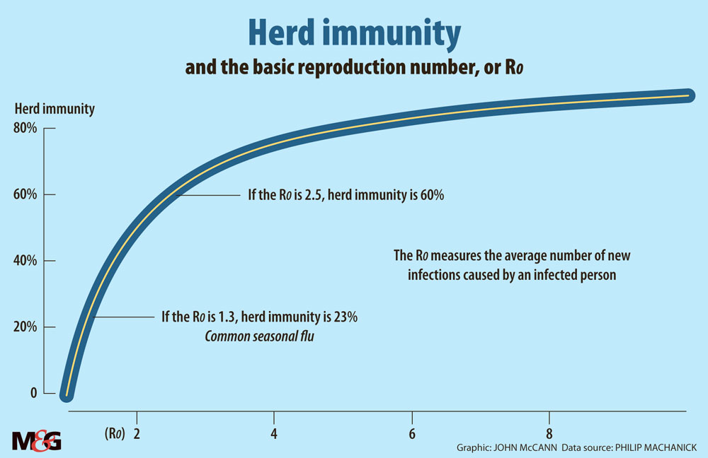
Herd immunity is not a target to aim for: the disease does not magically switch off. If you arrive at a 60% herd immunity point (corresponding to R0=2.5) while the disease is spreading at full speed, you overshoot and nearly 90% of the population is infected before it stops. Herd immunity is, however, a useful target for vaccination. If you vaccinate to that level or better, a new local outbreak rapidly pushes Rt below 1 and fizzles out.
Back then to what “flattening the curve” should really be about. If your nonpharmaceutical interventions consistently push Rt down to below 1, you have faked the situation where you have passed the herd immunity threshold. In other words, you make the disease behave as if it has a lower R0. If you keep this up long enough, it will eventually fizzle out with a much more consequential reduction in deaths than the “flattening the curve” rhetoric implies. The catch? If you lower your guard, it will flare up again and — as seen in the US and Melbourne in Australia — could result in pressure to go into lockdown again.
Not so many will die and other myths
Understanding the level of fatalities is another area of significant confusion. There is broad agreement on some things — age is a significant factor, as are comorbidities. The biggest confusion is over the fraction who die and potential worst-case scenarios in the face of inaction.
Estimating the effective fatality rate is complicated by a number of issues. Standards differ widely — one reason advanced for Belgium’s extremely high fatality rate is that all deaths that could be attributed to Covid-19 are counted, even without a positive test. In other areas, excess mortality (the number who die over and above the average for the time of the year) suggests that Covid-19 deaths are under-counted. Since most deaths are associated with comorbidites, without a test, you cannot be sure that Covid-19 is the proximal cause.
Counting deaths as a fraction of confirmed cases is unreliable because standards and coverage of testing also vary widely. Case fatality rate is also misleading when cases are increasing fast, because there is a lag between reporting cases and death.
Another complication is that in many areas, daily statistics dip over a weekend. It is implausible that the virus takes weekends off. The most likely explanation is that staff don’t work over weekends and get behind reporting and record numbers against the incorrect date.
The best we can do is look at a scenario where the disease is relatively far advanced and take that as a base for estimating. In the Bronx, more than 0.3% of the population has died. Testing for antibodies suggests that about 20% of the population in New York City has been infected. This suggests that more than 1% of the population could die if the disease is not checked by nonpharmaceutical interventions. That figure may be an overestimate because vulnerable groups could be disproportionately represented among those already infected. But even 0.3% projected nationwide is a lot of deaths.
One of the unusual attributes of the disease is wide variability in severity, with a large fraction only being mildly ill and many having no symptoms at all. This has led to the most ludicrous claim I have seen: that 80% of the population is immune. For this to be the case, R0 would have to be far higher than the common estimate of 2.5. For a disease to spread so fast, if 80% of the population is immune at the start, implies that it is one of the most infectious known, and there is no evidence to back this up.
How do we get out of here?
I am not sure what the government’s plan is but let us go with containing Rt. If we study the progression of Rt (calculated by various South African research groups), it has been between 1.2 and 1.4 since early in April. This indicates that the strategy has been at least partly successful and the final number of infections should be significantly lower than had we not acted.
The number of active cases has not peaked, so we are not in the same place as countries like Germany and New Zealand. Without effective contact tracing, the more likely outcome is a long slow road to bringing Rt below 1.
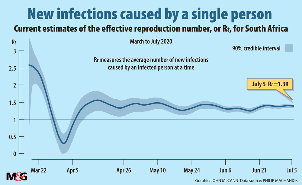
Complete suppression requires bringing Rt below 1; with Rt in South Africa fluctuating in a narrow band above 1, the number of cases continues to grow exponentially (about 5% a day and we can expect this to continue as long as Rt is in the same narrow band) — if at a much lower rate than without nonpharmaceutical interventions.
We still run the risk of health services being overwhelmed, if at a less dramatic speed than with unconstrained spread. If the models the government uses indicate a peak at a level that does not overwhelm the health system, they should publish the models and data. It would be interesting to know what they are doing to lower Rt and when a drop to below 1 is expected.
We really need a much smaller number of active and new cases to make suppression by testing, contact tracing and isolating viable.
Is there any good news out of all this? Slowing the spread has two benefits already: we have clearer ideas about treatment based on experience of those hit harder and earlier, and a clearer idea of risk factors. These two areas of improvement alone could significantly cut deaths.
Learn more
If you want to see stats in a cleanly-presented form including the evolution of Rt in South Africa, Media Hack Collective in partnership with the Bhekisisa Centre for Health Journalism maintains an easy-to-read dashboard.
The UK HealthKnowledge site has a simple introduction to epidemiology.
What Happens Next? COVID-19 Futures, Explained With Playable Simulations is a good place to visit to understand the relationship between R0 and Rt.
If you like playing with software, here is my herd immunity grapher.
The medical literature is extensive and harder for the beginner; these sources are a good start.
Philip Machanick is an associate professor of computer science at Rhodes University